As the Secret Knots webcomic enters a new year, I’d like to share some thoughts about things I’ve found out, through trial and error, in the years I’ve been drawing my stories. Beginning with something I’ve called my One Weird Trick for webcomics. Actually, it’s How I Begin a Long, Heavy-text Comic and Try Not to Lose Readers in the Process, but that’s an even worse title.
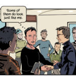
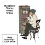
This is how I began a comic back in 2010:
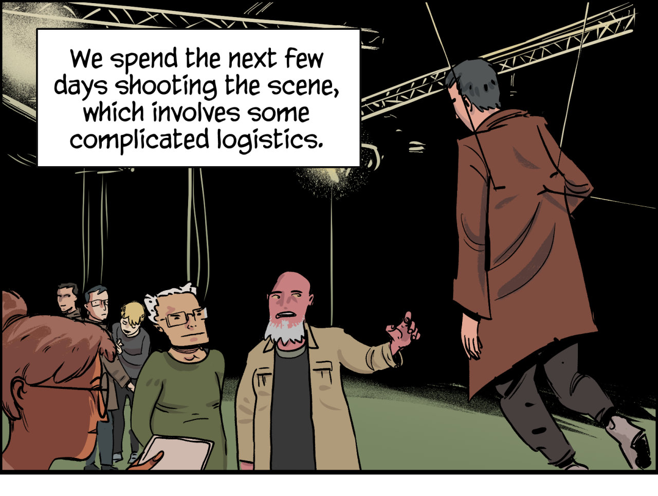
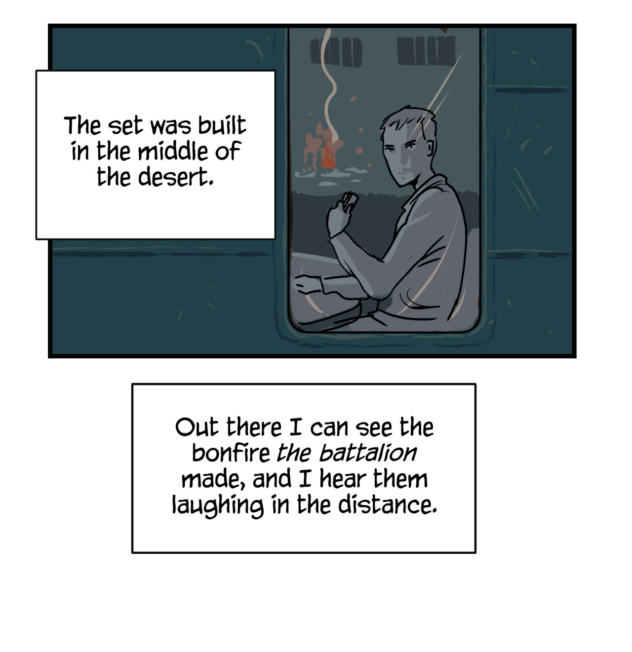
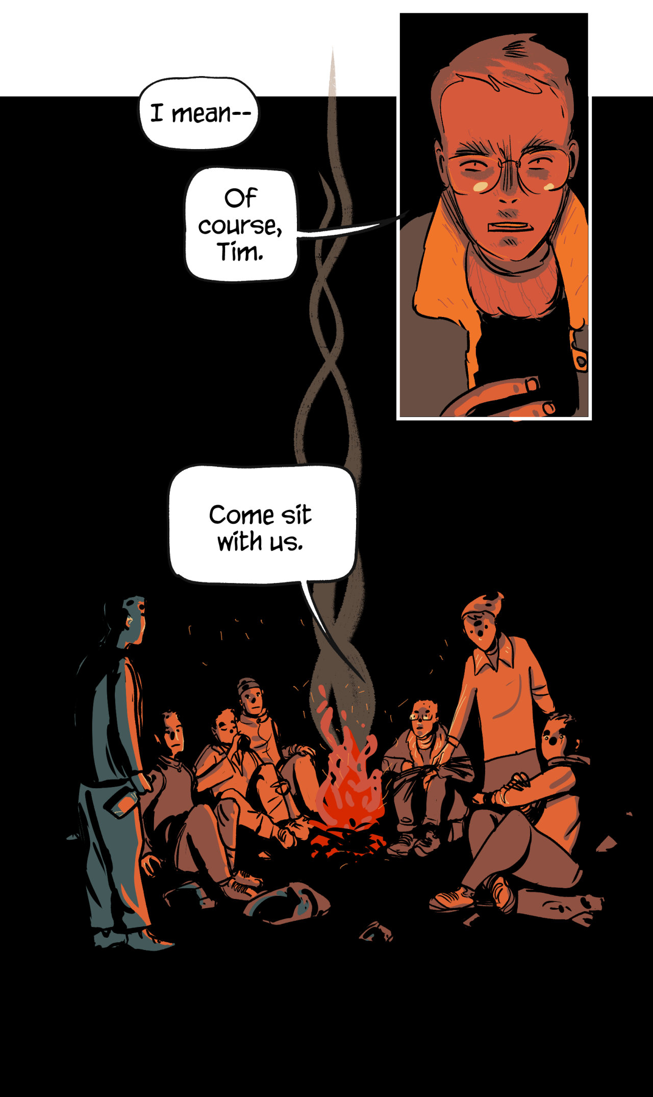
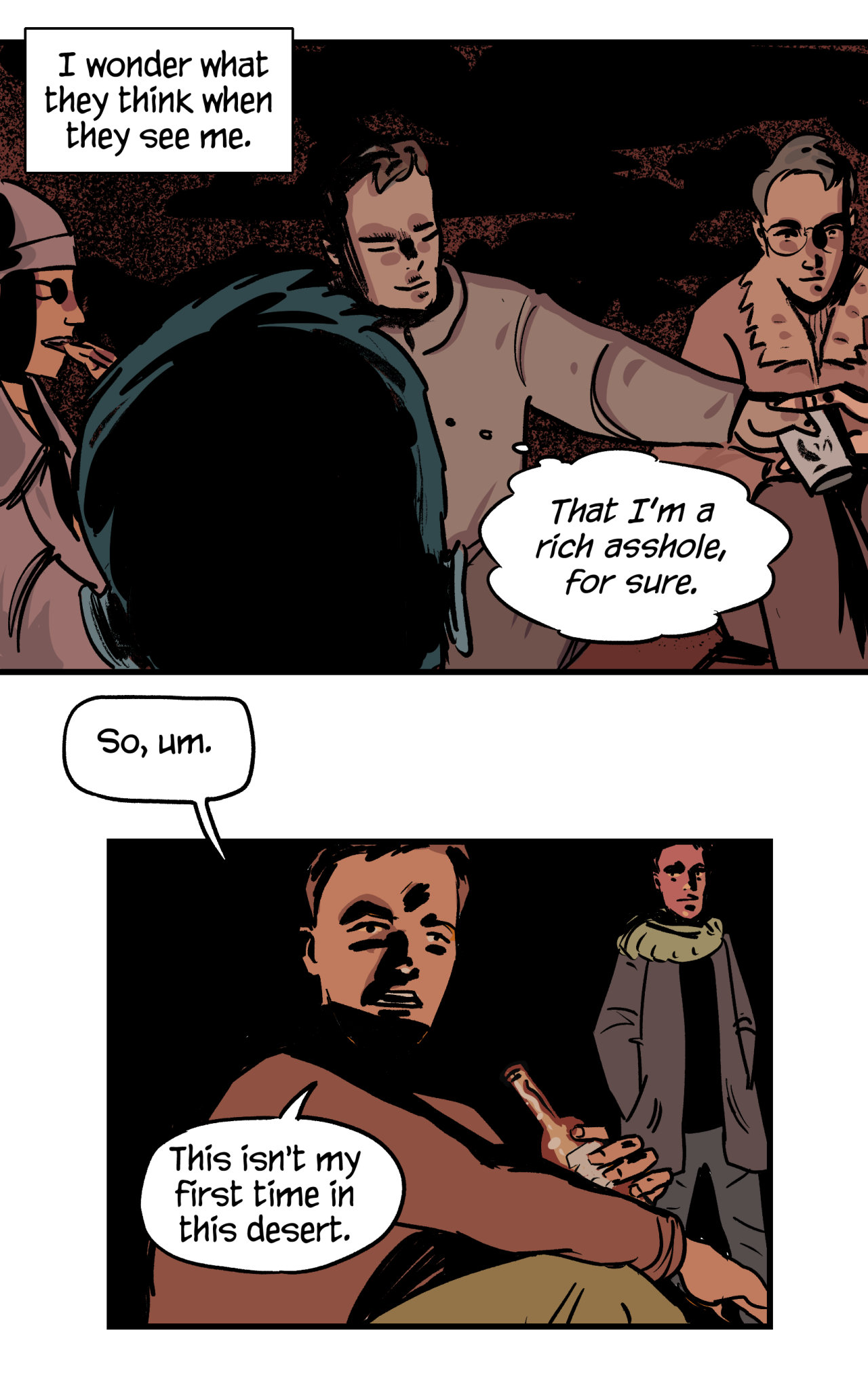
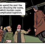
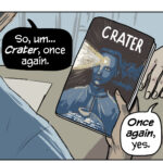
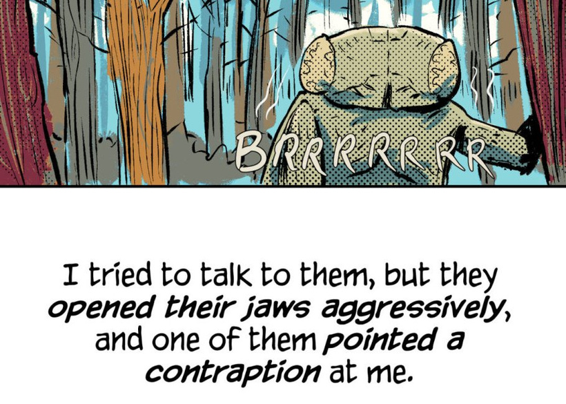
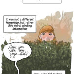
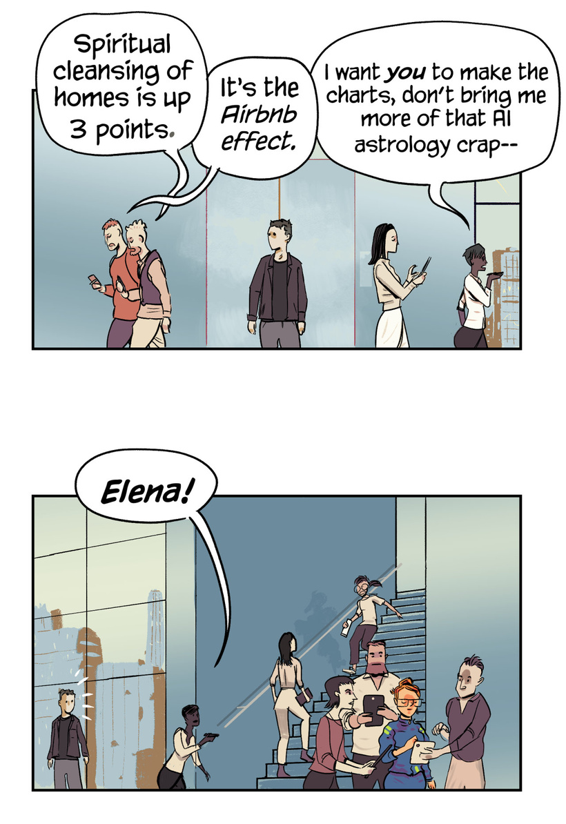
And this is the first “panel” of a comic from last year:
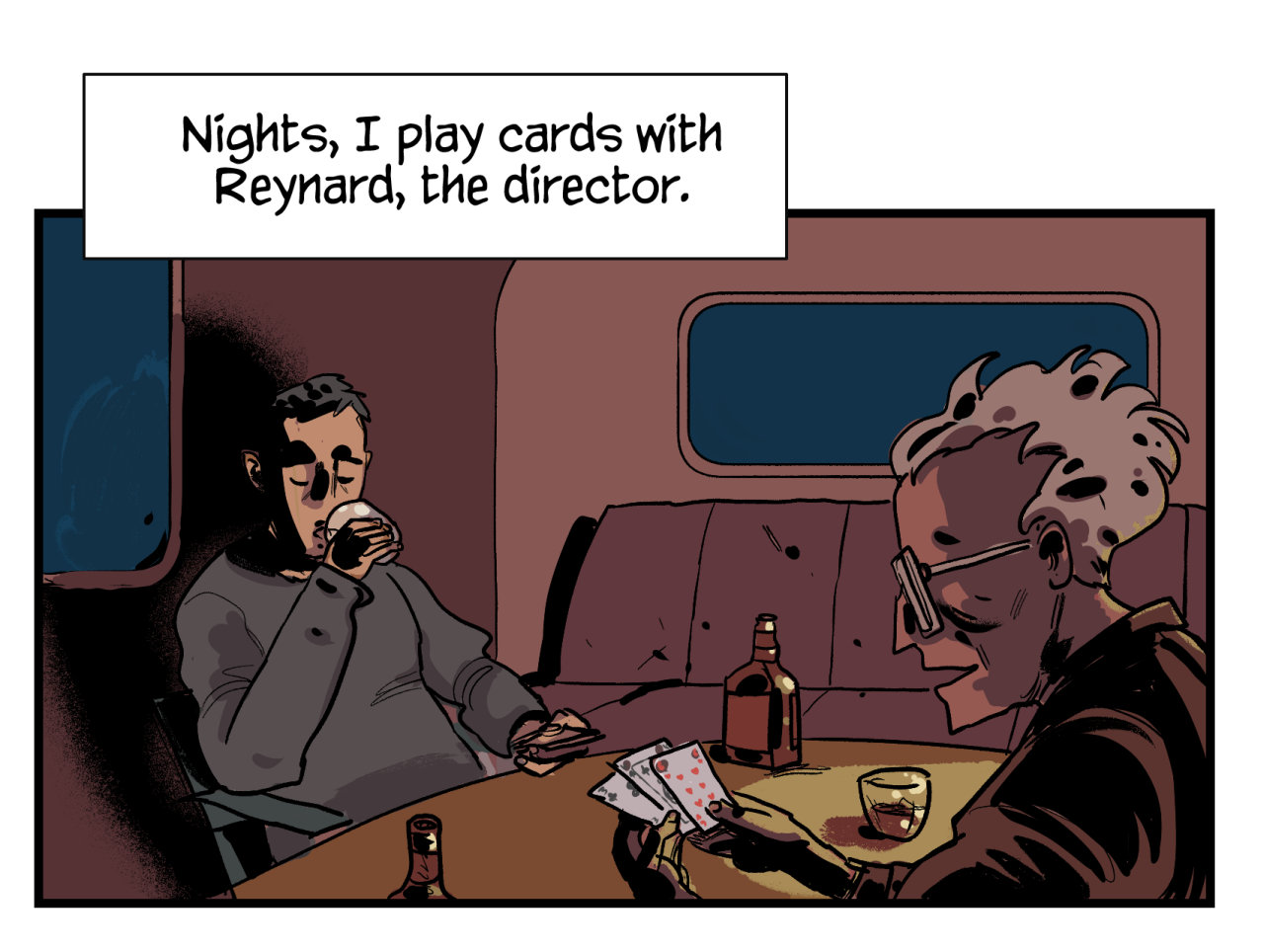
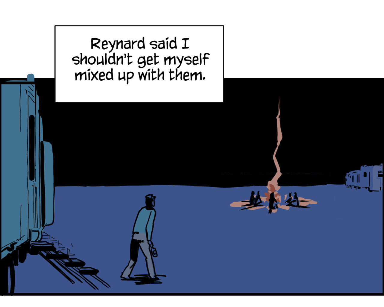
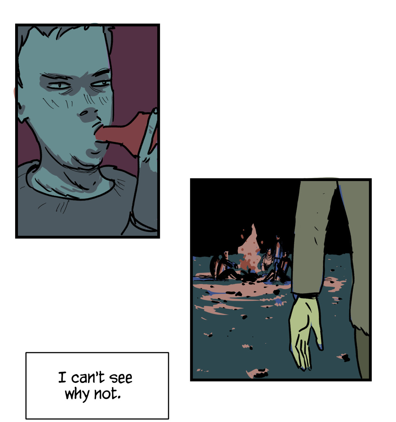
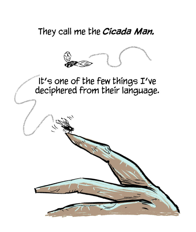
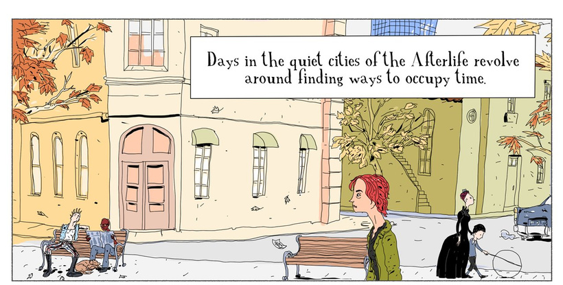
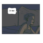
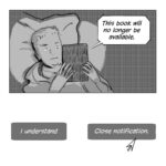
There are a couple of telling things about the different times when these comics were drawn: the older example is a landscape oriented panel, it also has a smaller and more intricate font. It was thought from the beginning for large computer screens. The second one alternates words and pictures right out of the bat; sentences are shorter, the font and disposition of art are planned to be phone-scrolling friendly; there’s even a visual cue (the cicada trajectory) that hints “scroll down to read”. While the start is somewhat minimalistic, the comic will feature some larger text boxes later:
But the comic opener scene is planned as simple and immediate it can be, in order to engage the reader and get them to the meatier parts later.
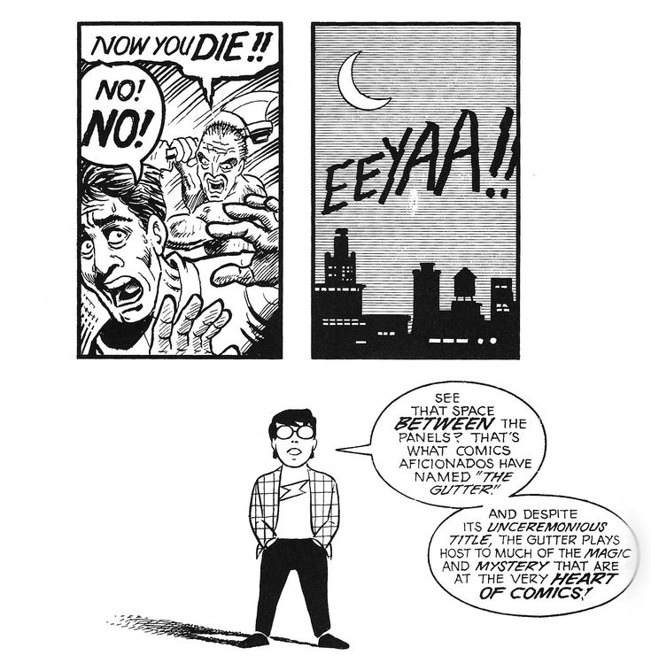
As Scott McCloud pointed out in Understanding Comics, the special thing about comics reading, the odd brain reconstruction of actions, movement and sound, happens between panels. This illusion sparks when you move from one action to the next, when the combination of images and words lead your eyes as smoothly as possible across the gutters, the separation between comics frames.
That’s one of the main principles of what counts for montage in comics. In scrolling comics, I want to get there fast, because that’s when things get good. So nowadays, in the era of constant distraction, I try to keep this rule of thumb for the first panels: to try to get the comic reading moving forward as quick as possible.
With webcomics, there are a lot of casual visitors who come to your piece by recommendation or algorithms. What they have in common is how fleeting their attention is. Most people will look at one or two panels, and briefly decide if they’ll be up for the ride. (or the scrolling). In Tumblr, the only social media where I can post full stories, my comics get automatically a “long post” cut. In that context, I’ve found that it’s much more engaging to begin with a clear visual cue than with a heavy text box. It flows much better, probably because before you know it, you are already on panel two or three, and the comics reading brain magic is already happening.
As you may know, The Secret Knots comics are complete, short stories, and often need a lot of exposition somewhere; sometimes a single scene may end up having a big block of text. There is no precise standard for this; Alan Moore said once that there should be a maximum of 30 words per panel, and that of course is for print comic books. It’s a sound rule, but circumstances may vary. With webcomics, I get to spread the text in portions and treat these balloons as accents, or rhythm cues along the strip. Long text and dialogue can be split in scrollable chunks: balloons can be placed outside the panel boxes (in the gutters!). Additionally, this text division allows a use that’s also present in traditional comics, when it serves as a connector for different scenes. Remember when Mulder and Scully talked on the phone, and they used that conversation to change scene / locations? It’s something like that, but with drawn text balloons.
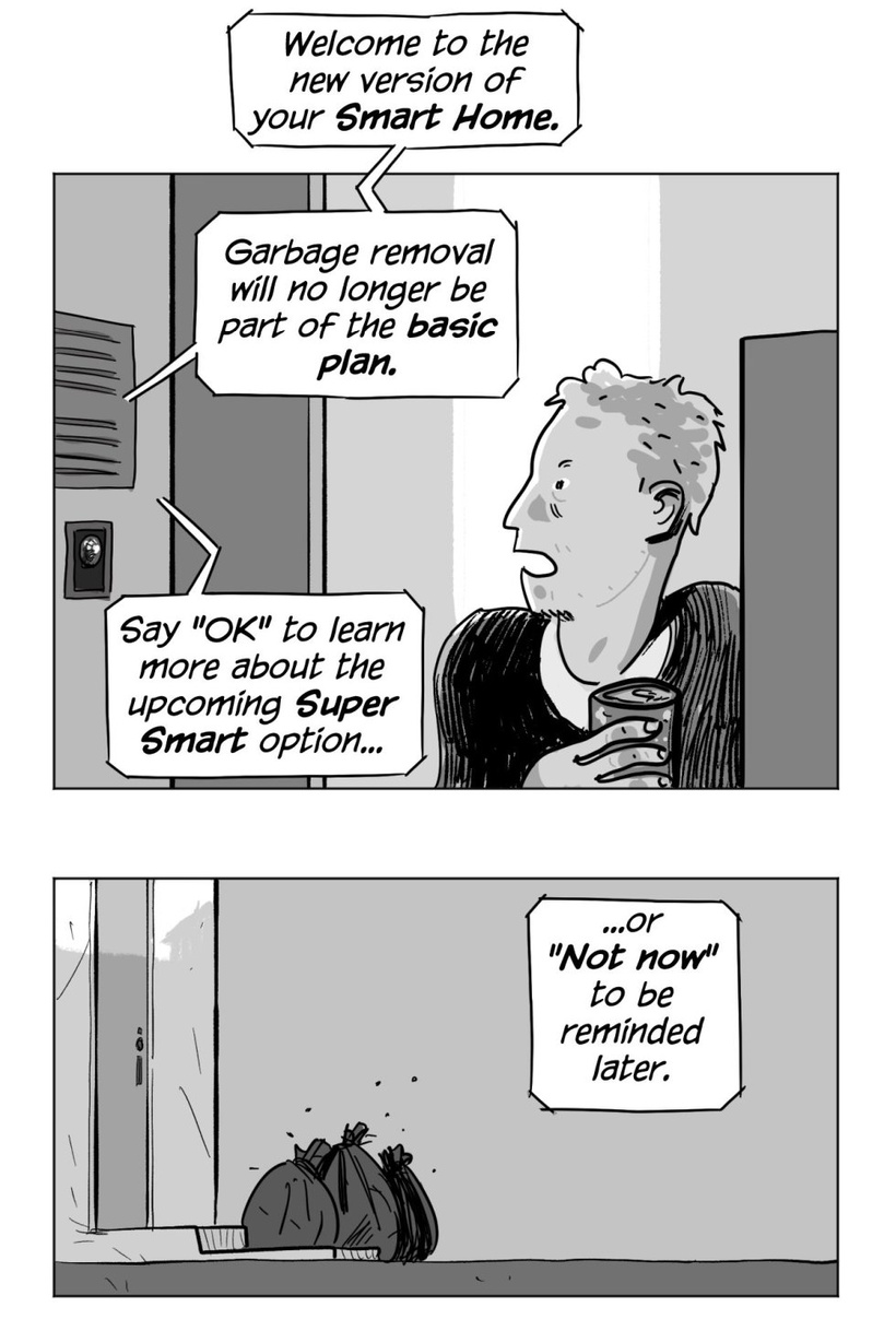
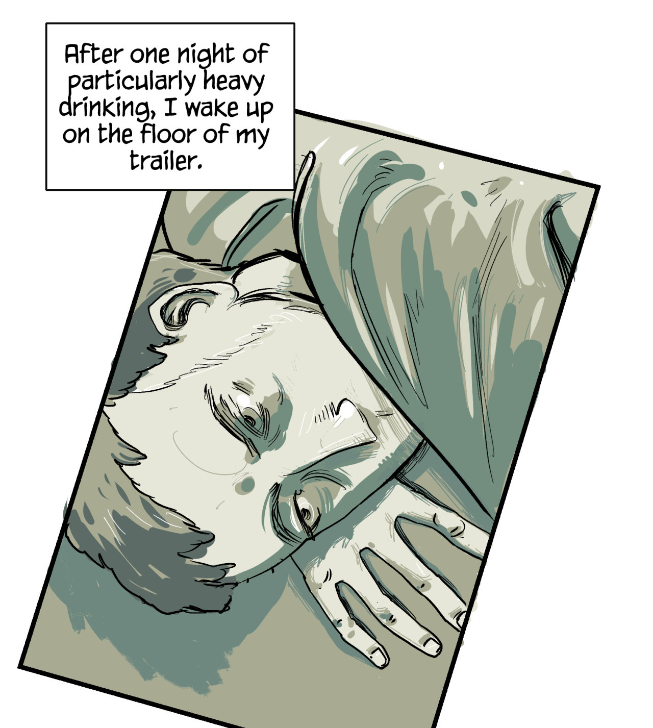
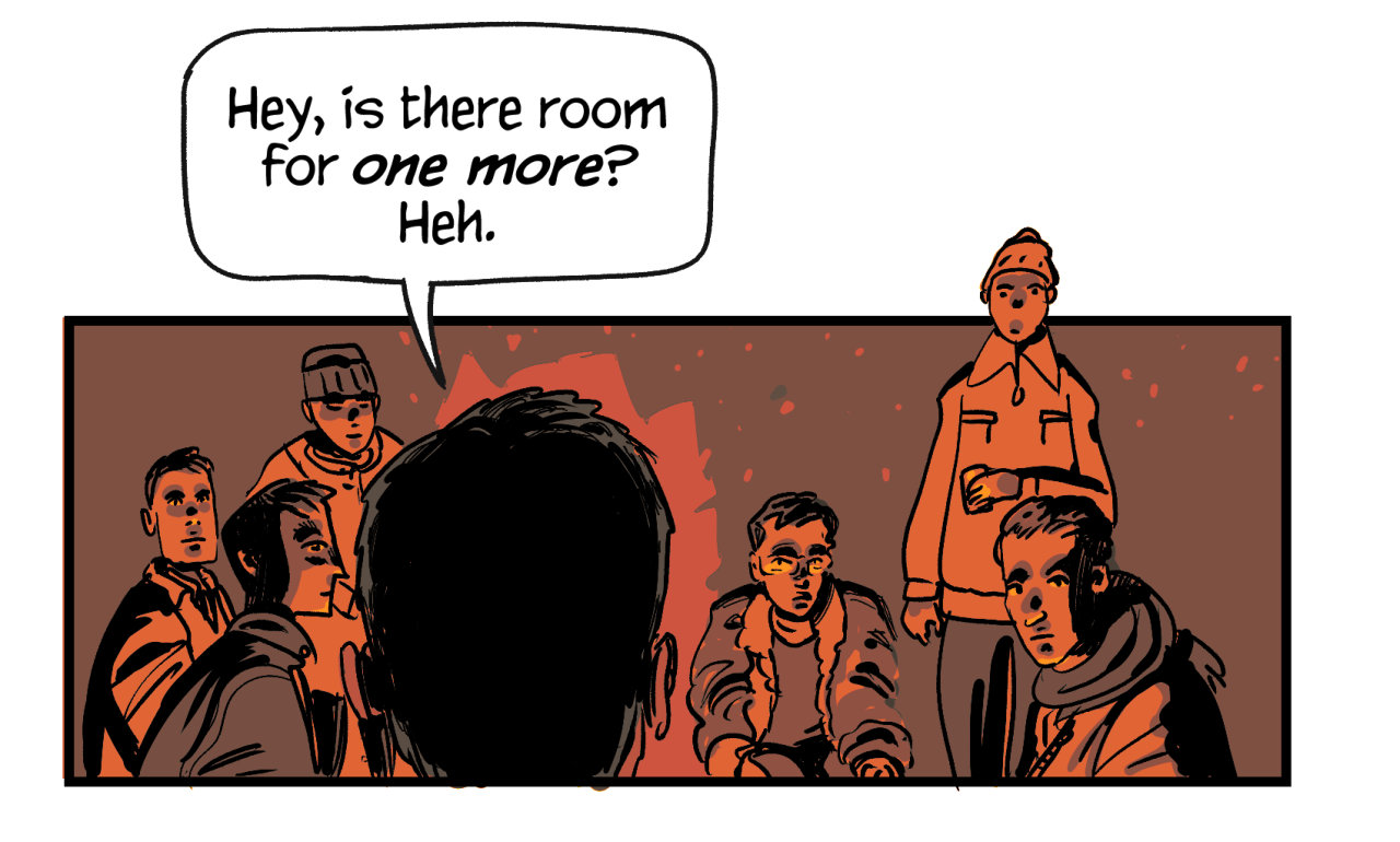
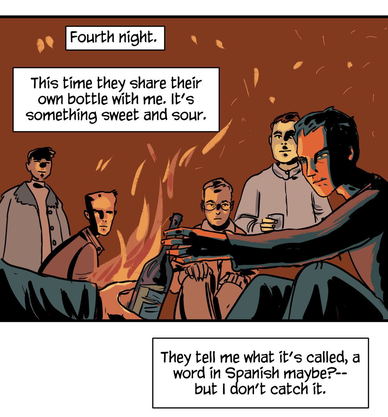
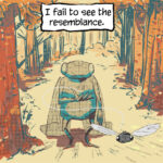
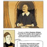
Since my stories frequently feature heavy exposition at some point, avoiding the text bombs at the very first panels is the rule. That’s my “one weird trick”: start with something visually interesting, short sentences, and move forward as quickly as possible. This is another example from older comics, but I think this one achieves immediacy, while still being an intriguing first establishing shot:
I don’t rule out exceptions, of course. It’s totally possible I try out a “compressed” narrative for the next comic, depending on the particular experiment. Moreover, none of this is to say that this is a universally better way, or that we should always aim for efficiency above depth of reading. I see it more like taking advantage of the unique features that scrolling comics have to offer. Maybe somewhere along these experiments in different types of comics lies a chance to discover new tricks for this art.
*****
Thanks for reading, and may you have a nice 2026.
Juan.
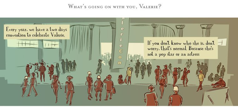
If you haven’t read it yet, check out the latest comic, a story about the only two fans of a niche film.
“Abyssal”