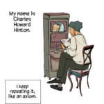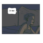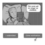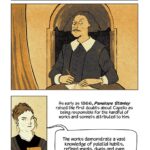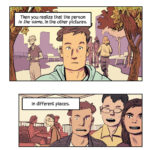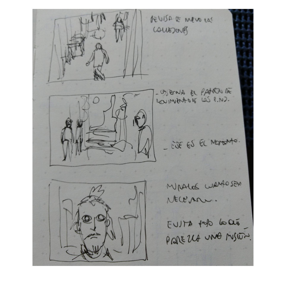
Here’s a brief peek into the stages of the upcoming story.
I do storyboards with barely comprehensible notes at the side in a small note book.

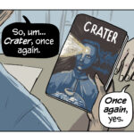
The thumbnails are also the way to get the rhythm of the text. Ideally it’s at this stage I discover that I need to break some scene into two frames instead of one but it’s not always so.
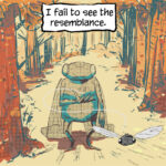
I draw in blue lines in another small book, this time in fabriano paper. It’s a bit yellowish bone-white and it has some texture which gives me the traction I like for fine ink pens.

I define very few details in blue lines. I like to find the shape of things when I’m at the inking step.

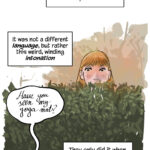
I’ve been trying different brush pens for tones: Kuretake and Koi mostly. I want to make a post soon showing how these brushes work in detail.
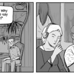
After scanning and processing the page (removing the blue lines, adjust contrast) I work the colors in photoshop. I work with a few layers of flat colors and fiddle a bit with each one until I get the color harmonies I look for in each frame. There are many reasons behind color choices: the tone of the story, the need to highlight certain details in the scene, a certain atmosphere I want to suggest. Sometimes practical needs, like establishing the difference between characters or a time shift.

I hope you have enjoyed this overview! If you are interested in knowing anything specific about these elements (inks, tones, color), leave me a note and I’ll make sure to get into that in another post.
Thank you very much for your support and I’ll see you very soon with the new comic, called “How to find Hapiness in a Video Game“, heh.

Juan S.